Months ago, I came across a woman named Jessica Lusk. She told me she had seen the website I designed for Rise Cupcakes in Friendswood and was interested to have me create a brand for her bakery that would find its home in the Heights of Houston. We met up when the inside of her storefront was nothing more than walls and a dusty, chipped concrete floor. I found a slice of wood in the corner to use as a makeshift seat and went to writing notes on all the things she envisioned. She stood in the doorway that day, telling all and I listened.
When I got home I was anxious, excited, full of life. This was exactly the type of work that makes me want to get up in the morning. She wanted a scripted, handwritten concept of sorts for her logo and that’s all I needed to hear before getting started. I spent hours drawing the letter R, curving, shadowing, erasing, darkening, then throwing them away. I even did a time lapse late one night of my manic aspirations. I wrote a blog post on the hard truths of handlettering and how it isn’t for the faint of heart. I came up with this messy idea and tried to pair it with clean, modern font styling. I was cross-eyed from working this into the ground so I made up my own color palette that hurt even my eyes in the first handlettered branding concept. I covered the presentation with disclaimers that anything was changeable, and it was. That’s how I like to do business as a designer you know. We settle on a price that includes the client’s sum of changes conducive to every project that also encompassed my willingness to give the client freedom. I just work to guide them through general best practices. Every designer is different and most of them think they know “the way”, even forcefully but this is surely what works for me, keeps my client’s morale high as well as my own. I realize that as “talented” or “creative” as designers are expected to be, I am still working on the livelihood of someone else’s dreams. My belief rides on the research I’ve done around observing designers (myself included) who, time and again put their heart and soul into something kick-ass that the client or end-consumer chooses against, preferring a far more crap-looking and dated design. The quicker I accepted this contrast between designer and client, the happier I got doing work that wasn’t my own personal choices. The client’s input, their personal association with the look of their own brand is of the front and center kind of importance when I design. I’ll show them the world that I can provide and sometimes they pick up on it and sometimes they don’t. The end product in this project though, made me even more open minded to collaborating with people’s minds, instead of touting that I know it all in the design industry. I damn sure don’t.
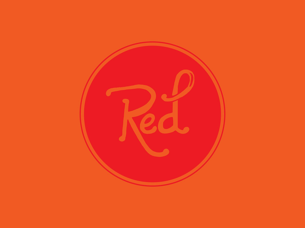
So we started with this rough handletter concept, you know, the one from my headache time lapse:
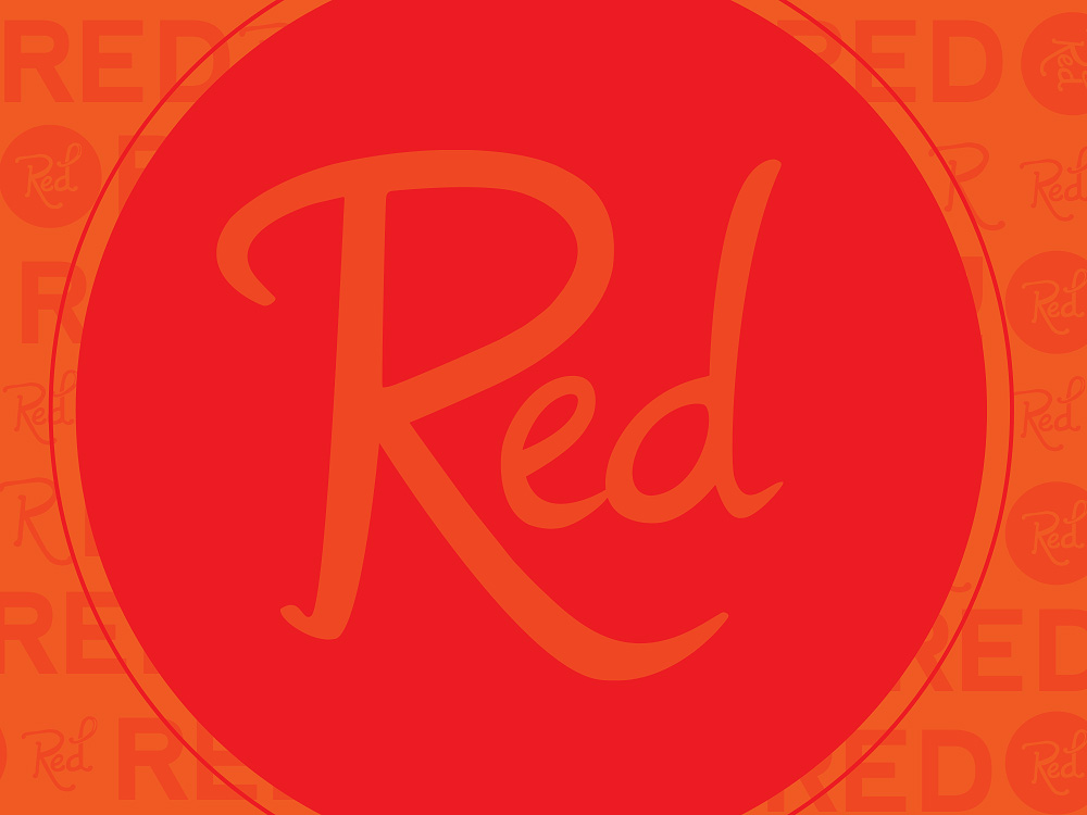
We discussed that the handletter was too rough, so I worked to refine it and then decided to introduce a little bit of branding. Albeit I made the lines smoother, it still didn’t feel right to either of us:
We landed on three things.
- First, the lettering wasn’t right. Let’s start looking at fonts that we can modify.
- Second, the orange was killing us both. Let’s just take that out. Seriously, as fast as we can. Forget it, make this first priority.
- Third, the shape that encompasses the wordmark itself wasn’t what Jess wanted. Let’s try some different options.
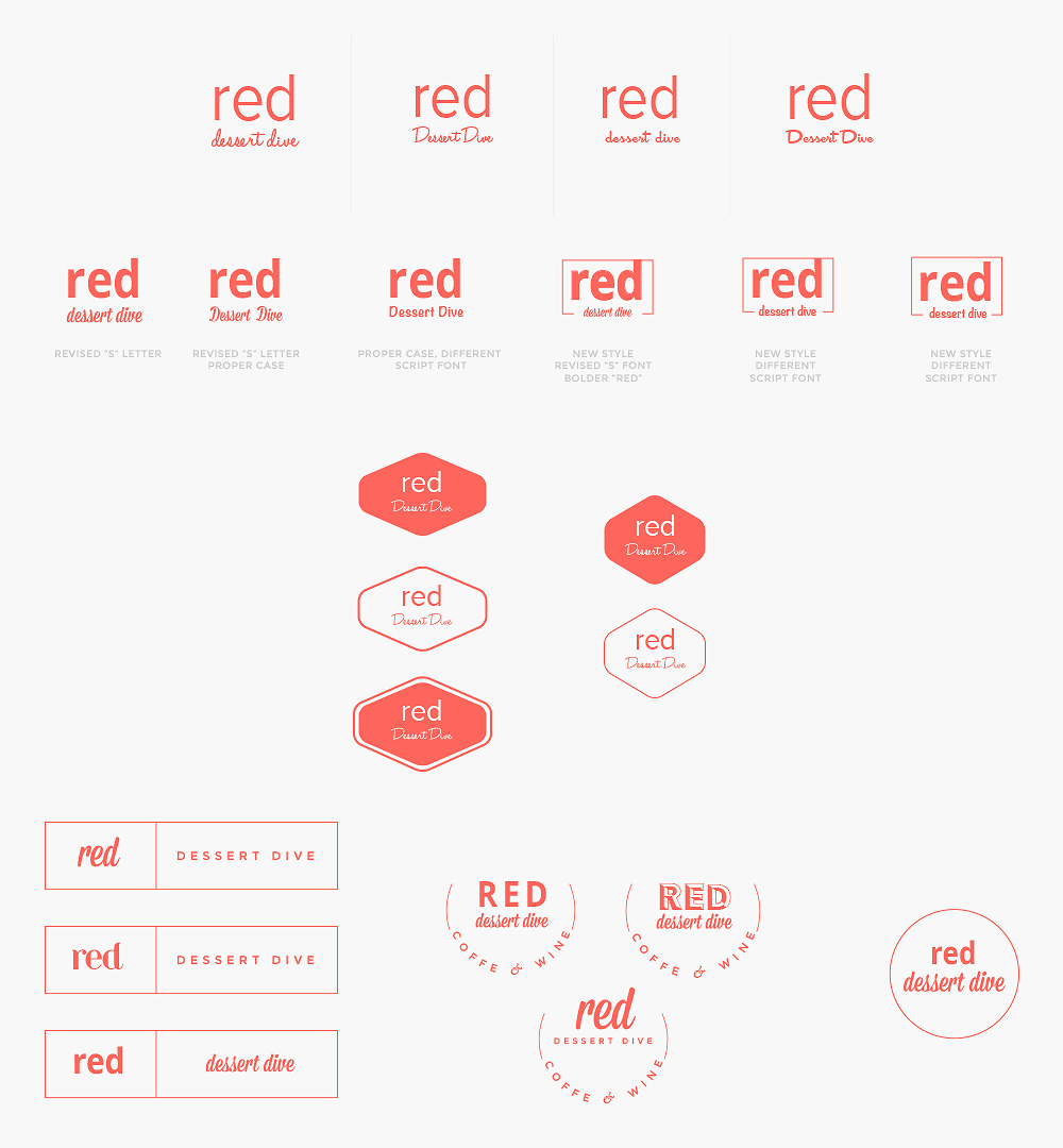
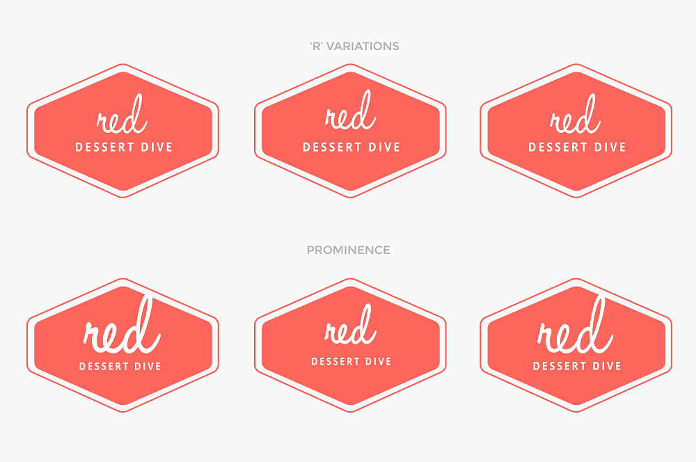
Options we did try. We filtered through combination after combination of font styles, uppercase, lowercase text styling and we played around just a little in the color of the red itself. Jess had explained she didn’t want a true “red” but more a warm, red-orange color.
I found myself becoming personally vested in this style here and had my fingers crossed that this was the style she’d want too.
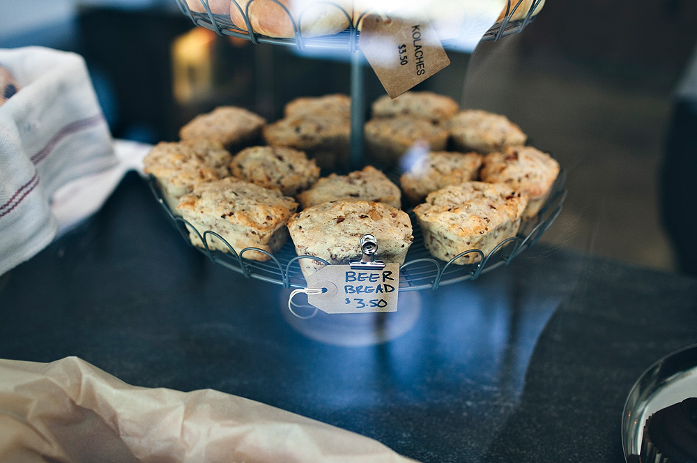
It wasn’t, and this reality in the design process is where I had to make a decision. I felt disenchanted. It wasn’t news to either of us. Should I keep digging for motivation, listen instead of pushing and try to understand Jess and her vision, or be a brat because my own ideas weren’t being used and make this a miserable experience? I asked her for a meeting where my goal was to understand her as if she was my best friend that I had known my whole life. I watched as her eyes lit up about how much she loved music, Pearl Jam, Jimmie Hendrix, Johnny Cash and how she wanted to inject that into the aesthetic of her storefront, her brand. She wanted a clean modern yet metal, rustic(almost) feel. She talked about how she planned to bake beer bread and sell wine. I realized then and only then that she wasn’t asking for anything close to what I had done for Rise Cupcakes, though she referenced it often at first, how much she loved what I’d done for them. She had only liked that I was able to portray that bakery’s lifestyle, which did target an entirely different audience even when they would be selling similar baked goods. I walked away, passionate to make this something we could both be proud of.
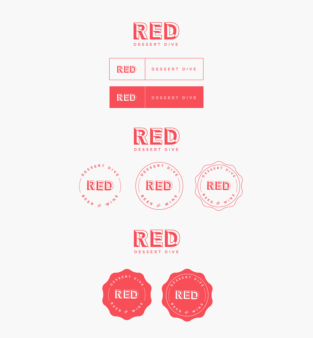
We talked about fonts and came across one that finally hit the spot. After some modifications and consideration to wordmark placement, we had a winner.
Jess finally fell for this concept:
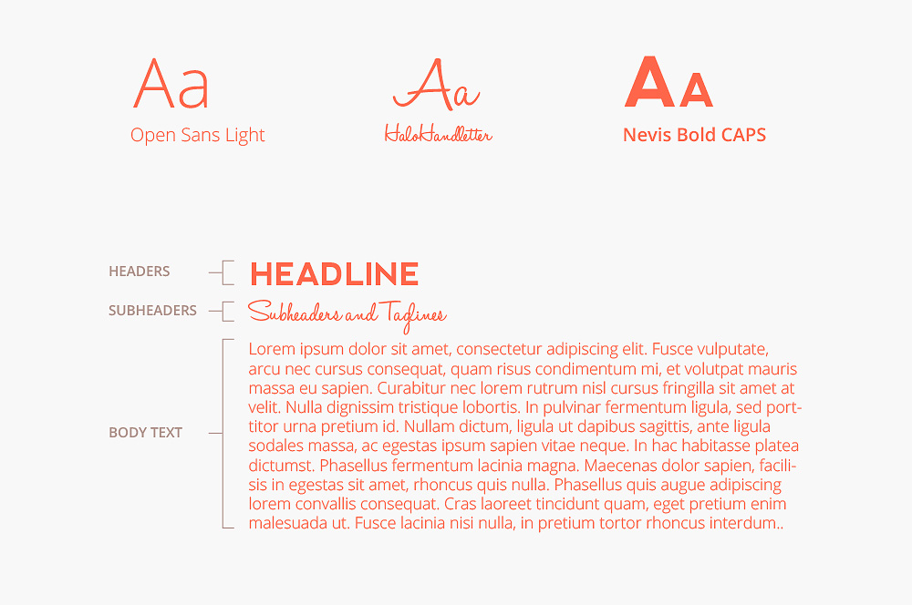
I worked to build out a supporting color palette and typography guide for her Brand Standards that also comes with my logo design packages.
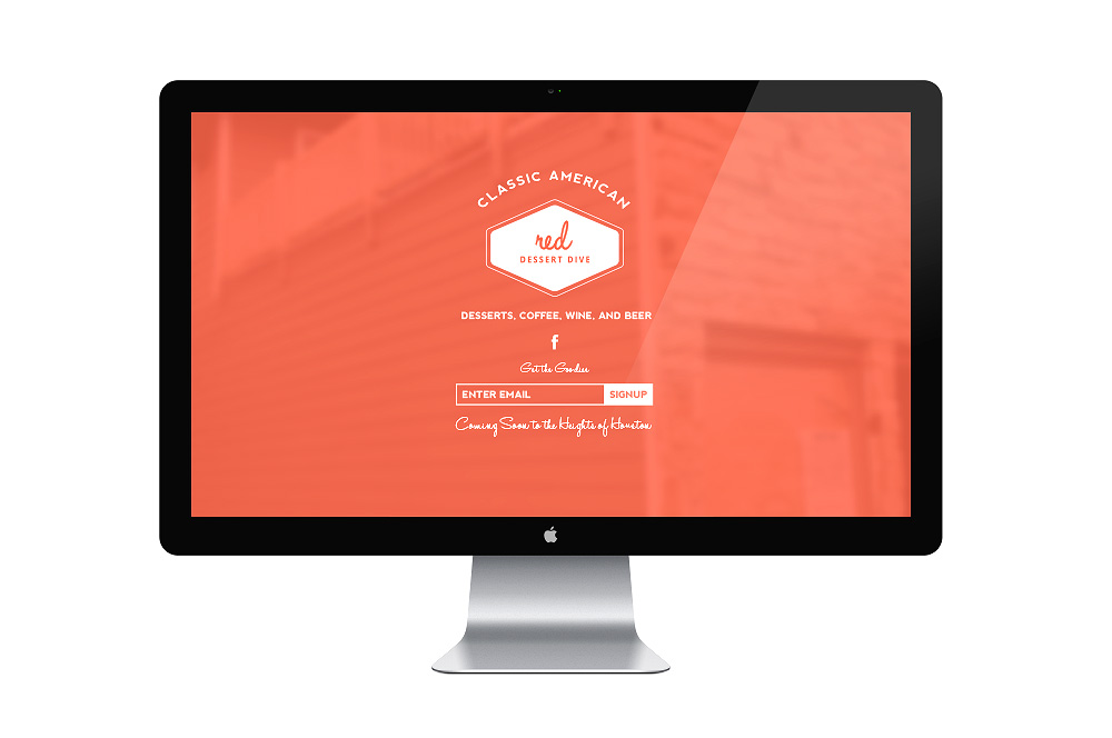
Another reality soon surfaced. It gets hard, tiresome even to work with a logo on flat colors when you can’t see it in its environment. Luckily, it was time to step away from clicking the mouse and instead, clicking the camera. This was the glue that put it all together for us both. Before we could get started on the shoot, Jess and I had to talk website development. She asked if I could create a quick splash page to help people know what was coming and to capture some e-mail addresses for later marketing that the store would open before the site was up. Not a perfect world scenario, but a typical occurrence. I started with the splash page, got it up and then headed over for the photoshoot once the storefront had opened.
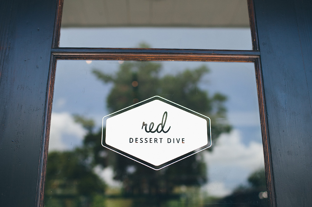
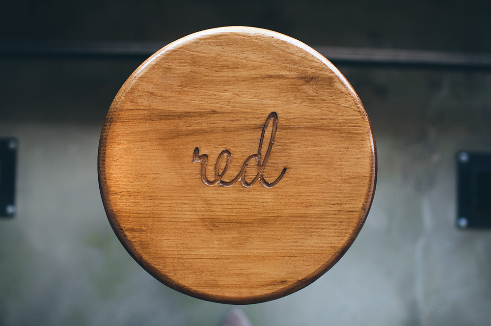
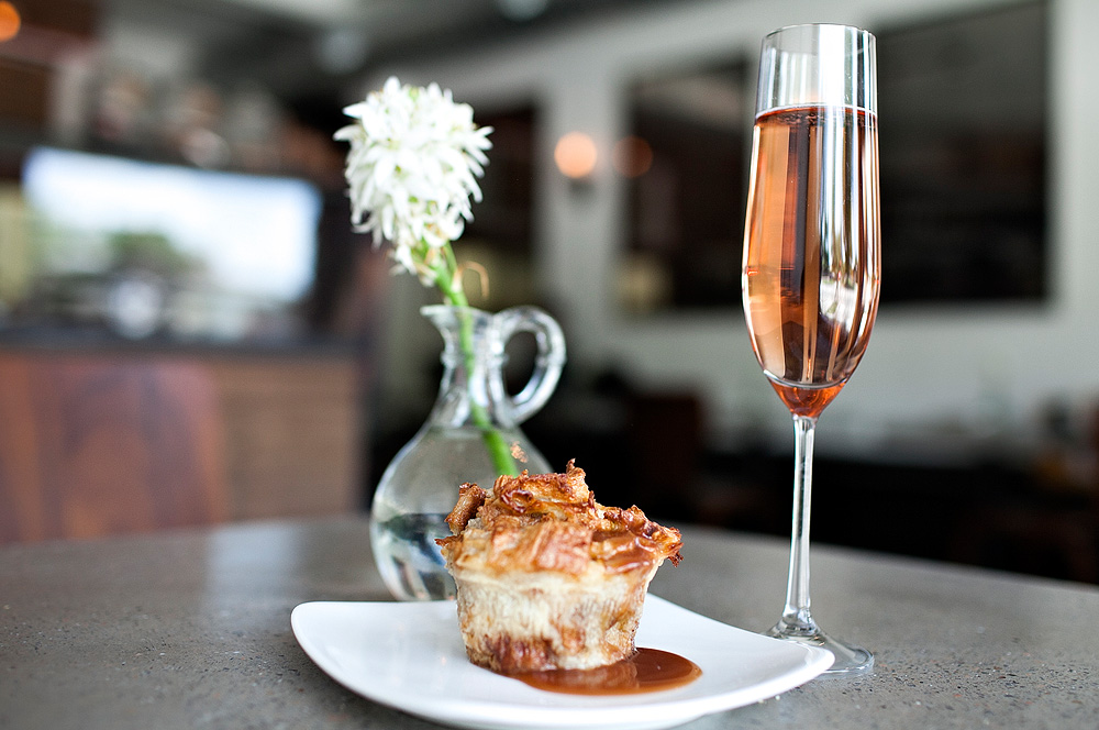
 When I walked into Red Dessert Dive, I was in awe to see the brand in full effect, on the stools, on signs, on the front door. It was beautiful! The display of her baked goods was even more beautiful.
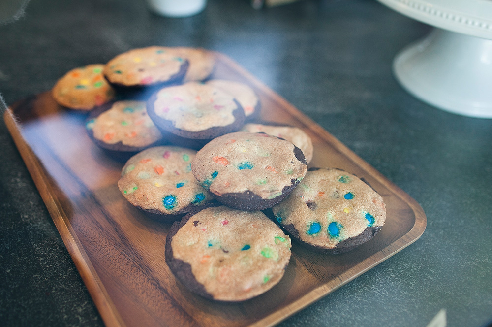
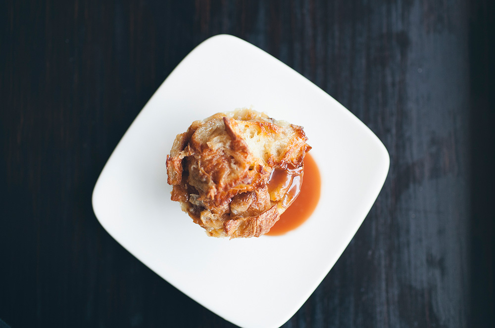
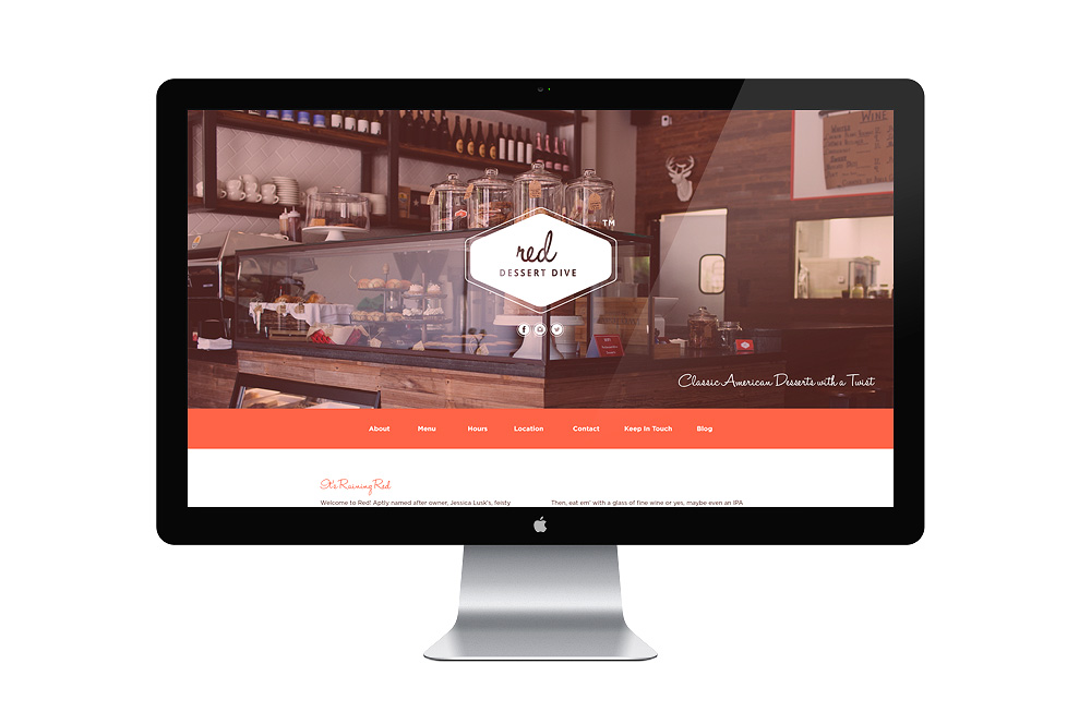
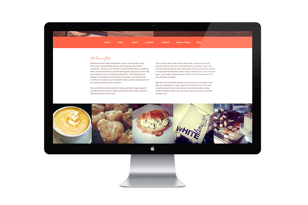
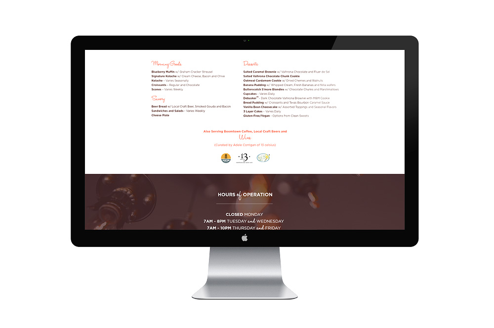
I turned around to use the photos throughout her website realizing that would bring the entire thing full circle and it did. Her brand looked beautiful paired with photography of her baked goods and her storefront space. We used a full bleed background image on the home page to help give interested customers the vibe happening there are Red. We plugged in an Instagram widget to help keep the site fresh without having to call me every time just to make the site feel alive again. We articulated the menu and shed light on the partnerships she has with Boomtown Coffee and others. This has been a favorite project where I was able to use all areas of my creativity, [logo design, handlettering, photography, web design]. It was a thick progression but we picked up and ultimately succeeded. She has been featured throughout many magazines, news channels, and local newspapers here in Houston. She has also trademarked an incredible eat there at Red Dessert Dive called a Debusker. It’s a hybrid chocolate chip cookie with M&Ms and brownie that became something ever so short of Heaven. I am honored that Jess had me run the gamut of branding for her business and am headed there for a drink before I head to Marina del Rey to photograph a conference for the C-Suite Network.

